Don’t hide or disable menu items?

I wholeheartedly disagree with this over on Joel on Software.

Actually, I agree with not hiding functionality, but nothing (including menu items) should be enabled in the UI if it is not possible to perform that function. That is not to say developers should be lazy – don’t just disable things because it is inconvenient for you (the developer) to let them do it. If it is reasonable, leave it enabled, and lead the user through what they need to do to perform the task.

However, there are things in most programs which you really cannot do at a certain point in time, and that should be clear to the user, along with why it is not possible, and how to proceed. The user should never be left at a dead end. On the same not, however, the user should never be led to believe something is possible, only to be denied.

As I write this, I figure I do not wholeheartedly disagree, but I do disagree – like most broad, generalized statements,  it is wrong, or at least not entirely right.

Advertisement

What Microsoft Doesn’t Want You to Know about WPF

Looking at Eric Sink’s post What Microsoft Doesn’t Want You to Know about WPF – gee, I thought I was the only person who coded on vacation (at least that is what my wife tells me).

Anyway, I agree with the observation that “beautiful” is definitely not the default for WPF – certainly not until Microsoft’s toolset catches up. Maybe then beautiful will be the default, or at least a selectable option.

I guess the point, though, is that WPF is supposed to let you separate design from coding, and enable you to let designers design, and programmers program. I have never actually seen this work in the real world, but I am forever hopeful. The fact is, though, that no technology or tool is going to protect you from creating ugly designs – the same as using the right language will not guarantee you will not produce bad code, and having the right process does not guarantee that your project will be a success. All it does is improve your odds a little. Maybe. if you are lucky.

Is Vista as bad as they say?

Over the last few months (or the last year or more), it has become extremely fashionable to beat up on Vista. Heck, it is a great way to generate hits on you site or blog, maybe get Dugg, whether you have anything useful to say or not. I am talking about posts like this, or this, or this whole blog.

Personally, I run Vista on several machines, and have few problems which were not related to the failure of third parties to provide updated drivers, or updated versions of software for Vista (sometimes makes me wonder if there has been a conspiracy on the part of other vendors to purposely sabotage Vista – but it is more likely just not bothering to provide what customers pay for). I also still run XP on a couple of boxes, and Win2K3. On my main development box, I also run a number of operating systems in VMWare, including WinXP, Win 2K3, Fedora, Ubuntu, and several “minimalist” Linux distros for playing around with.

An unfortunate fact of life is that all operating systems available right now suck, at least in some aspect or another. Linux suffers from many driver limitations (though this is getting better), and a wannabe user interface that spends far too much time trying to look like Windows, while missing the point of usability altogether. Windows (all versions) suffer from security issues, and from performance and stability issues inherent in trying to be all things to all people. I will not comment on Mac OSX, because I have not run it. It is also kind of irrelevant, since I cannot run it unless I buy Apple’s hardware.

Vista has its own usability issues. Some that are pointed out are valid. The UAC implementation is moronic. The UI path you have to follow to connect to a wireless network is annoying. Here is one I discovered today – disk defragmentation. When you defragment you hard drive you get this useful dialog:

defrag

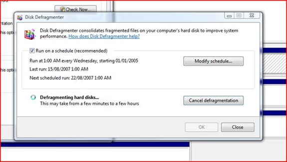
Isn’t that helpful? No progress indication. No estimated time to completion. Just a statement that it could take anywhere from a few minutes to a few hours. Gee, thanks.

The problem is, this kind of thing is not just a problem in Vista, or Windows in general. It is pervasive in all operating systems, and almost all software written to run on them. Most software is filled with minor little usability gaps like this.

So stop beating up on Vista (unless you need the traffic), and start thinking about how to make the whole situation better.

GigaOM Web Innovators Group: Boston Startups Come Out & Present «

I noticed this over on GigaOM GigaOM Web Innovators Group: Boston Startups Come Out & Present «. I noticed that a company called frevvo. This company was founded by a gorup of people I have worked with in the past. They have some cool technology that is worth checking out (I would describe it, but hey, go look for yourself!)

Usability – interesting analysis of WordPress

I just had a look at the results of this interesting usability analysis of WordPress.

While I do not necessarily agree with all of it, it is a very good analysis, and most of it makes sense. The biggest thing I liked in it was the concept of “not getting noticed”. As much as I love slick new UI models, and lots of graphics and animation, in reality the best software in the world is software you do not even think about. As a user, I should be focusing on what I am trying to do, not how I am going to make the software do it. Especially for any activity which requires any level of focus, having to constantly context switch from thinking about your work to thinking about whether the software will let you do it is extremely invasive.

I had not really thought before about the design of WordPress (hey, I started using it because it is free!), but overall it seems pretty good. Goodness knows, if it had done things to annoy me, I would have whined about it on my blog somewhere!

Search Visualization – at least I am not the only one

There is a post About visualization tools over at Tech IT Easy. It is nice to see that I am not the only one who would like to see a better way to work with search results. Why is it that over the last 10-15 years, almost everything on the Web has become more and more visual, but search has stayed largely the same?

Usability Rant – Searching the Web for Documents, and saving them locally

I spent much of the morning (as I frequently do on weekends) doing research on a topic which has caught my interest through the week. I use a number of sources – sometimes just a web search, often a more targeted search like ACM’s or IEEE’s digital libraries. Usually, I do not read the documents I find right away. I like to search, find a significant number of interesting papers, and then I transfer the documents to my Tablet where I can read them, mark them up, and take notes.

This morning I was searching one of the digital libraries (I will not say which one, because I do not think my issue is with a specific library, as much as with the whole web), and saving the documents out to a sub-folder in my Documents folder under Windows Vista. So, the sequence of actions was like this:

  1. Perform a keyword search on the topic of interest
  2. Start looking at the list of hits presented 10 at a time (like almost all web search – I have already talked about how much I hate this model)
  3. I click on the available PDF to view it, which opens another browser window (Rant #1: I cannot right-click and save this document because the link does not point at the actual PDF, but to some sort of delivery system).
  4. In the new window, I am asked to authenticate myself for this content, even though I have already authenticated when signing in to the document library site (this is Rant #2).
  5. Having re-authenticated, I finally get to see the document (in the latest Abobe Reader UI – which I am not too fond of either – maybe it will grow on me).
  6. I click the button to save a copy of this PDF, and a File Save dialog pops up. (Rant #3: Every time I go to save, it defaults to my Documents folder, as opposed to remembering where I saved the last dozen or so documents. Rant #4: Where ever the focus is in the File Save dialog, it is NOT in the list of documents and folders – so I start spinning my mouse wheel to scroll down and find the folder it should have defaulted to in the first place, only to notice nothing is moving, so I have to click in the list box, and then start scrolling. Rant #5: Wouldn’t be nice to have a button somewhere, similar to the Save and Save As buttons, but which allowed you to “Save this to the last place I saved stuff and where I have been saving stuff for an hour”, in one click?) 
  7. About once every 5 or 6 saves, for some reason it DOES remember what folder I was saving to, which is a good thing, but because it is not consistent, it further interrupts the rhythm of my work. (this is Rant #6)
  8. Periodically as I am going through the search results (in that annoying “10 at a time” list), I will click to view a document and once again be prompted to authenticate, presumably because my session has expired or something. (Rant #7: This should not happen. I have not been away from my keyboard, and I have not paused my work in anyway. The session time-out should detect that I have been active all this time, and should reset. I should not have to repeatedly re-authenticate.)

Admittedly, these are all minor issues. Individually, they would seem not even worth talking about. Together, however, they destroy the overall experience of what I am doing. The destroy my train of thought. They force me to break out of thinking about WHAT I am doing, and think about HOW I am doing it. They waste my time, a fraction of a second at a time. And they annoy the crap out of me!

The sad thing is that this is not an isolated experience. This is the norm, rather than the exception. The computers and software upon which we have come to depend, and which are supposed to make our lives easier, on a frequent and consistent basis, rudely interrupt us with stupid questions and inconsistent behaviour.

There is constant talk in the technology world about “the next big thing”. I, personally, would be thrilled if the “next big thing” were a concerted effort by the technology community to make the current big thing WORK PROPERLY!