Windows 8: 5 Things that Really Bug Me

I have been running Windows 8 for a while now (as many people have, given Microsoft’s approach to releasing “previews”). I started playing with it just after the //Build/ conference in 2011, and switched to running it full-time on all of my day-to-day computers back in June. I even blogged a bit about my initial experiences, but I stopped because there was not that much to write about. It is my personal experience that once you get past the initial shock of the user interface changes, doing day-to-day work on Windows 8 is not all that different than Windows 7 (note I am referring to Windows 8 here, not Windows RT).

I really like Windows 8, but I am not sure I would upgrade to it “just because”. If it is on a computer I buy, I will enjoy using it, but will likely not upgrade any more machines.

But…there are some things about Windows 8 that annoy me to no end. Like most things Microsoft does, Windows 8 is 80% great, and 20% ranging from annoying to intolerable. Here are my top 5 issues (at least for today).

It Is Not Finished

This has been said by many reviewers. Some refer to it as not finished, others as schizophrenic. Still other descriptions have been even more colourful.

My issue is specifically with the features which require you to switch to the traditional desktop to do things.

One example is computer settings. While the Settings charm allows you to get to some settings (either directly or via the Change PC settings link), the vast majority of settings require you to jump to the Desktop and open the Control Panel, just as you always have.

Sorry, Microsoft, that is just plain lazy. If there is a setting to which you want users to have access, then present it through your Modern UI.

Another example is Windows Explorer. Why do I have to go to the Desktop to move files around, look for files, etc. I can see maybe having the Desktop Windows Explorer there as a last resort, but I should be able to do anything a normal user would want to do with files through the primary UI. If Microsoft cannot figure out a good way to use the Modern UI paradigm to implement file manipulations, then it isn’t a very strong paradigm.

 The Mail App

I am torn on my opinion of the Mail app. Actually, no I am not – I hate it.

For the most part, there is nothing intrinsically wrong with it (other than the lack of support for POP3 – I mean come on!). There is also nothing especially right about it either. It looks like pretty much every other mail client out there.

When I read the post Building the Mail app, it is clear that the team put a lot of thought into how to build the Mail app. Unfortunately, much of it was wrong.

Yes, it supports various “Windows 8 glitter”, like sharing contracts, search, Live Tiles, pinning accounts, etc. But is that enough?

I really would have liked to see email “reimagined” a little . The way it came out just looks like traditional email prettied up a little (very little). Could no one imagine any strategy using the Metro design language/Modern UI to actually make working with email better?

The PDF Viewer

What could go wrong with a PDF Viewer, right?

Well, how about not remember things like how I use the software? Or at least giving me the ability to tell the software what settings I want to change?

The big one for me is Continuous versus Single Page reading. I like to have PDFs in continuous mode. And, every time I open a PDF in the PDF App, I tell the app I want to use Continuous view. And every time, it forgets.

I know this is a nit-picky kind of thing – but it is endemic in Microsoft’s Apps. To not remember my preferences automatically is bad design. To not even allow me to set my preferences is unforgivably bad design.

SkyDrive App

Ok, this is another very small thing, but I run into it so often that it drives me nuts.

Open the SkyDrive App, select a file, and click the download charm. You are then presented with a UI to allow you to choose a destination folder, and a button that says “Choose this folder”. So far so good, right?

Click the button. The button then switches to say “Ok”. Congratulations! You have now added one completely useless interaction to something I will do all the time. Yes, I might have selected the wrong folder, but it is hardly irreversible. If it is the wrong folder, I can move it. Don’t annoy me on every interaction, just to handle the “exception” case.

Office Apps

I am not talking about the Office Desktop applications here, or even the Office RT applications, but about the Modern UI/Windows Store apps – OneNote MX, and Lync 2013.

Both of these are cute proof-of-concept sort of apps, but they are functionally really disappointing. I sympathize that the Office team was probably brought into the game quite late, and that they were in middle of their own major product release cycle, but better not to release anything that what you have. Neither of these are good examples of Modern UI apps, and some of the missing pieces are really stupid (why can’t I change the pen colour in OneNote MX? why can’t I pin a User or Group from Lync to the Start menu?)

There are other things that bug me, but these are the five which are top of mind today. I also kind of annoyed at some of the limitations of the App development model, but that will have to wait for another post!


Advertisement

Usability: Are “Stupid Users” really just a symptom of lazy software?

Any conversation with programmers or technical support people regarding users will often lead to many stories about “can you believe how stupid users are?” But how often is it really the software that is stupid, rather than the users?

Users frequently make some very simplistic assumptions about software (or computerized devices in general):

  • Simple things will work
  • If it lets me do it, everything must be ok.

These are not really bad assumptions. Many of the things the mere users try to do only sound stupid to those “in the know” – those who have been suitably trained and conditioned by software to know that the perfectly reasonable things the user wants to do are indeed stupid.

Take an example. A user has an MP3 file, and they really want a WAV file. Naively, the user renames the file from a .mp3 extension to a .wav extension, and is baffled that the file does not behave as a WAV file. We all know that this is not how software works, right? This user then becomes another story for some tech support person.

However, there was nothing wrong with the user. The user wanted a WAV. The OS let him rename the file from .mp3 to .wav, so everything must be ok, right?

I would suggest that it is the software here that is stupid, not the user. Or more correctly, the software is just lazy. It cannot be bothered preventing the user from doing things that don’t make sense. It cannot be bothered acting in an intuitive manner, or at least informing the user that it is not acting so. Hey, maybe the software could actually do something useful, like convert the MP3 file to a WAV file, which is what the user wants in the first place. Or at the very least, tell the user how to do it.

In general, users are not stupid. They just want to do stuff, and they expect software to allow them to do it in an intuitive manner. So if your tech support logs are filled with stories of “stupid users”, maybe you should have a long, hard look at your software.

Don’t hide or disable menu items?

I wholeheartedly disagree with this over on Joel on Software.

Actually, I agree with not hiding functionality, but nothing (including menu items) should be enabled in the UI if it is not possible to perform that function. That is not to say developers should be lazy – don’t just disable things because it is inconvenient for you (the developer) to let them do it. If it is reasonable, leave it enabled, and lead the user through what they need to do to perform the task.

However, there are things in most programs which you really cannot do at a certain point in time, and that should be clear to the user, along with why it is not possible, and how to proceed. The user should never be left at a dead end. On the same not, however, the user should never be led to believe something is possible, only to be denied.

As I write this, I figure I do not wholeheartedly disagree, but I do disagree – like most broad, generalized statements,  it is wrong, or at least not entirely right.

Interesting article on the "OS Wars"

This article from PC Magazine is interesting. It does a fairly good job of looking at the pros and cons of various OS’, without the silliness of most such discussions. The only aspects of it I think are a little unfair are the “Price” and “Installation” scores, both of which rate Mac OS better than either Windows XP or Vista.

On the price side, while it is true that you can buy Mac OS for less than Windows, you cannot (at least if you are a typical user) install it on your existing, non-Mac hardware. So the true cost of a typical user switching to Mac OS includes the cost of buying a completely new computer, at a premium price.

On the installation side, again the comparison is not quite fair. Both Windows and Linux are general-purpose OS’ which have to be able to install on a wide-range of hardware and almost unlimited permutations of hardware configurations. Again, Apple does not have this problem with Mac OS, since Apple tightly constrains (though not as tightly as it used to) the hardware configurations with which Mac OS must contend.

Overall, though, not a bad article.

New laptop & Another try at Ubuntu

Well, as I dicussed in a previous post, I have been in the market for a new laptop. I have finally bought one. I decided to go for a Dell XPS rather than Apple (mostly due to cost). Such is life – maybe I will try a Mac next year. It is my intent on my new laptop to either dual boot Vista and Ubuntu, or (if I have a good enough experience with Ubuntu), just run Ubuntu and do all of my Windows stuff in hosted virtual machines.

So, last night I take my brand new laptop, and my newly burned Ubuntu CD, and set out. Ubuntu boots up from the CD just fine, but the screen resolution sucks because Ubuntu is philosophically opposed to loading the drivers for my video card. No big deal, I can live with 800×600 until I get a proper install done. So, I click on the install icon, and away I go. Or, actually, I don’t. It seems the Installer UI is not expecting 800×600 resolution, and the buttons to let me proceed through the installation are lost off the bottom of the screen. I also do not seem to be allow to resize this window. It being midnight and all, I gave up. I am sure there is some way around this, but I did not feel like screwing with it.

I will probably have another shot at trying to set up Ubuntu or some other Linux distro this weekend. Maybe I will have better luck and not just give up on Linux (sorry folks – this is stuff that should just work!)

PS – Vista is working fine on my new laptop. Transfered my files and settings from my old machine using “Windows Easy Transfer” – not a problem.

What Microsoft Doesn’t Want You to Know about WPF

Looking at Eric Sink’s post What Microsoft Doesn’t Want You to Know about WPF – gee, I thought I was the only person who coded on vacation (at least that is what my wife tells me).

Anyway, I agree with the observation that “beautiful” is definitely not the default for WPF – certainly not until Microsoft’s toolset catches up. Maybe then beautiful will be the default, or at least a selectable option.

I guess the point, though, is that WPF is supposed to let you separate design from coding, and enable you to let designers design, and programmers program. I have never actually seen this work in the real world, but I am forever hopeful. The fact is, though, that no technology or tool is going to protect you from creating ugly designs – the same as using the right language will not guarantee you will not produce bad code, and having the right process does not guarantee that your project will be a success. All it does is improve your odds a little. Maybe. if you are lucky.

Is Vista as bad as they say?

Over the last few months (or the last year or more), it has become extremely fashionable to beat up on Vista. Heck, it is a great way to generate hits on you site or blog, maybe get Dugg, whether you have anything useful to say or not. I am talking about posts like this, or this, or this whole blog.

Personally, I run Vista on several machines, and have few problems which were not related to the failure of third parties to provide updated drivers, or updated versions of software for Vista (sometimes makes me wonder if there has been a conspiracy on the part of other vendors to purposely sabotage Vista – but it is more likely just not bothering to provide what customers pay for). I also still run XP on a couple of boxes, and Win2K3. On my main development box, I also run a number of operating systems in VMWare, including WinXP, Win 2K3, Fedora, Ubuntu, and several “minimalist” Linux distros for playing around with.

An unfortunate fact of life is that all operating systems available right now suck, at least in some aspect or another. Linux suffers from many driver limitations (though this is getting better), and a wannabe user interface that spends far too much time trying to look like Windows, while missing the point of usability altogether. Windows (all versions) suffer from security issues, and from performance and stability issues inherent in trying to be all things to all people. I will not comment on Mac OSX, because I have not run it. It is also kind of irrelevant, since I cannot run it unless I buy Apple’s hardware.

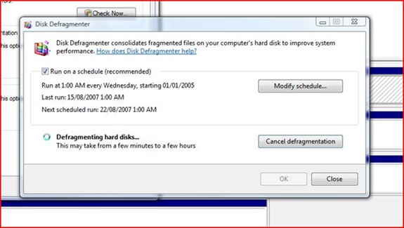
Vista has its own usability issues. Some that are pointed out are valid. The UAC implementation is moronic. The UI path you have to follow to connect to a wireless network is annoying. Here is one I discovered today – disk defragmentation. When you defragment you hard drive you get this useful dialog:

defrag

Isn’t that helpful? No progress indication. No estimated time to completion. Just a statement that it could take anywhere from a few minutes to a few hours. Gee, thanks.

The problem is, this kind of thing is not just a problem in Vista, or Windows in general. It is pervasive in all operating systems, and almost all software written to run on them. Most software is filled with minor little usability gaps like this.

So stop beating up on Vista (unless you need the traffic), and start thinking about how to make the whole situation better.

Usability – interesting analysis of WordPress

I just had a look at the results of this interesting usability analysis of WordPress.

While I do not necessarily agree with all of it, it is a very good analysis, and most of it makes sense. The biggest thing I liked in it was the concept of “not getting noticed”. As much as I love slick new UI models, and lots of graphics and animation, in reality the best software in the world is software you do not even think about. As a user, I should be focusing on what I am trying to do, not how I am going to make the software do it. Especially for any activity which requires any level of focus, having to constantly context switch from thinking about your work to thinking about whether the software will let you do it is extremely invasive.

I had not really thought before about the design of WordPress (hey, I started using it because it is free!), but overall it seems pretty good. Goodness knows, if it had done things to annoy me, I would have whined about it on my blog somewhere!

%d bloggers like this: