Welcome to The Continuum – Part Two

Earlier today, I began to explain The Continuum as an experiment in Social Brainstorming. But that is only half the story (actually, a third, but we will deal with that later).

Beyond this, The Continuum is meant as a demonstration of a Seamless User Experience.

The Continuum grew out of a very simple exercise in which I was brainstorming a new (for me) subject area. While reading about this topic, I was recording (short) thoughts on PostIt notes, and putting them randomly all over the whiteboards in my office. I was doing this in the hope that patterns would eventually emerge – patterns I would not otherwise see.

While I was doing this, someone came into my office, and over the course of our discussions, the question arose as to why I was not using some computer-based tool to do this (I am, after all, a nerd). The reality is, unfortunately, that no tools exist which would allow me to do this without the technology getting in the way. Any computer-based tool tends to make assumptions about how you work, or worse yet force a pattern of work on you. Or you spend more time playing with the tool than you do capturing ideas. This cognitive friction in software means that I tend to lose ideas while trying to capture them, or at least lose the flow of ideas.

It should all be as simple as scribbling on a PostIt note, and slapping it on a whiteboard.

But it isn’t.

We now live in a world dominated by mobile devices. That said, there are still a few (hundred million) PCs in use. Even more, there are now many large format displays offering rich multi-touch experiences, as well as other modes of interaction including gestures and voice recognition.

The question then arises “What constitutes a great user experience in this new world of multi-modal interactions?” This is often described in terms of a Natural User Interface (NUI), which is unfortunately defined somewhat circularly as an interface which feels natural (ok, not quite that obviously, but nearly).

While this is a question I have been pondering for some time, I do not have an answer, or at very least not the answer (if I did, I would be a lot richer and more famous than I am!)

One aspect of the new user experience that is key to The Continuum experiment is that the user experience should be seamless across all (or at least most) devices. Note that this does not mean that all devices should deliver all of the functionality of the solution. What it does mean is that the solution should exist on all devices, presenting those aspects of the functionality which is appropriate to the device format. Let’s call this Device Appropriateness.

In addition, the user interface should be as transparent as possible. As much as possible, the user should interact directly with content, rather than interacting with content through some artificial UI constructs. Buttons, menus, icons – these are all artificial UI constructs. In a perfect world the UI is completely disappears.

Device Appropriateness.

Cognitive Transparency.

This is The Continuum.

Advertisement

Bill Buxton: “NUI – What’s in a name?”

Recently (early October) Bill Buxton gave another talk nominally about Natural User Interfaces. For those who don’t know, Bill is Principal Researcher at Microsoft Research and has a 30 year involvement in research, design and commentary around human aspects of technology, and digital tools for creative endeavour, including music, film and industrial design (and a lot of other things, but I am not going to copy and paste his whole bio!).

The presentation, given at Microsoft Development Center Copenhagen, covers a lot more than just current ideas around NUIs. It looks back at the history of efforts to develop natural and touch user interfaces going back to the early 70s, as well as looking at what exactly we are trying to accomplish with these UI paradigms, what natural really means in a UI, and what makes good design in general.

While I highly recommend taking the time to watch the entire video, here are a few points I found really interesting:

  • The “Long Nose”: the concept of the “Long Tail” turned around, indicating that technologies (even successful ones) have a very long lifetime before they get on anyone’s radar, and in fact are usually in existence for about 20 years before they become major industries. This interesting implication of this, is that if you are looking for technologies that will be game-changers (can’t believe I used that term – I hate it) 10 years from now, you need to be looking that technologies that have been around for 10 years already.
  • Ask what your idea is worst at: Every idea is best at something and worst at something. It is just as important to be able to identify what your idea is least suited for as what it is best at.
  • You do not succeed in spite of your failures; you succeed because of your failures.
  • There is nothing all that new or revolutionary in the iPhone, iPad, Surface, or any other tablet-like devices. Most of the technology they rely upon has existed for 20-30 years or more).
  • Many people are stunned by how far technology has come (smart phones, touch interfaces, etc.), when really it is surprising how little progress has been made, given where things were in the 70s and 80s.
  • Most of us still carry around paper notebooks of some sort in order to scribble notes, sketch ideas, etc. We were getting to the point of replacing them with Tablet PCs. Unfortunately that is going away now with the current  generation of smartphones and slates, since they have done away with the stylus because marketing people have told us (so it must be true) that we do not want to take notes or make sketches.
  • The next generation of natural user interfaces need to be context aware. Not software context aware, but real context – where am I, what is the environment, what are the constraints.
  • Why the buttons on women’s clothes are all wrong!

Those are just the things I found interesting. The video is about 90 minutes long (60 minutes of presentation, 30 of Q & A), but it is well worth the time it takes to watch.

 http://channel9.msdn.com/posts/TechTalk-NUI-Whats-in-a-Name

User Interface Things I Hate #1543

Whenever I send a text message on my cell phone, it pops up a message (and plays a sound) telling me that the message was successfully sent – forcing me to dismiss the message if I want to do anything else.

Don’t tell em the message was sent – I assume it was sent, becuase it is sent 99.99999% of the time. Only tell me on the rare occassion it isn’t sent (which has never actually happened to me), because that is the only time I have to do anything. Think of all the annoyance that would save.

What Microsoft Doesn’t Want You to Know about WPF

Looking at Eric Sink’s post What Microsoft Doesn’t Want You to Know about WPF – gee, I thought I was the only person who coded on vacation (at least that is what my wife tells me).

Anyway, I agree with the observation that “beautiful” is definitely not the default for WPF – certainly not until Microsoft’s toolset catches up. Maybe then beautiful will be the default, or at least a selectable option.

I guess the point, though, is that WPF is supposed to let you separate design from coding, and enable you to let designers design, and programmers program. I have never actually seen this work in the real world, but I am forever hopeful. The fact is, though, that no technology or tool is going to protect you from creating ugly designs – the same as using the right language will not guarantee you will not produce bad code, and having the right process does not guarantee that your project will be a success. All it does is improve your odds a little. Maybe. if you are lucky.

Is Vista as bad as they say?

Over the last few months (or the last year or more), it has become extremely fashionable to beat up on Vista. Heck, it is a great way to generate hits on you site or blog, maybe get Dugg, whether you have anything useful to say or not. I am talking about posts like this, or this, or this whole blog.

Personally, I run Vista on several machines, and have few problems which were not related to the failure of third parties to provide updated drivers, or updated versions of software for Vista (sometimes makes me wonder if there has been a conspiracy on the part of other vendors to purposely sabotage Vista – but it is more likely just not bothering to provide what customers pay for). I also still run XP on a couple of boxes, and Win2K3. On my main development box, I also run a number of operating systems in VMWare, including WinXP, Win 2K3, Fedora, Ubuntu, and several “minimalist” Linux distros for playing around with.

An unfortunate fact of life is that all operating systems available right now suck, at least in some aspect or another. Linux suffers from many driver limitations (though this is getting better), and a wannabe user interface that spends far too much time trying to look like Windows, while missing the point of usability altogether. Windows (all versions) suffer from security issues, and from performance and stability issues inherent in trying to be all things to all people. I will not comment on Mac OSX, because I have not run it. It is also kind of irrelevant, since I cannot run it unless I buy Apple’s hardware.

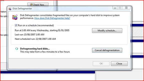
Vista has its own usability issues. Some that are pointed out are valid. The UAC implementation is moronic. The UI path you have to follow to connect to a wireless network is annoying. Here is one I discovered today – disk defragmentation. When you defragment you hard drive you get this useful dialog:

defrag

Isn’t that helpful? No progress indication. No estimated time to completion. Just a statement that it could take anywhere from a few minutes to a few hours. Gee, thanks.

The problem is, this kind of thing is not just a problem in Vista, or Windows in general. It is pervasive in all operating systems, and almost all software written to run on them. Most software is filled with minor little usability gaps like this.

So stop beating up on Vista (unless you need the traffic), and start thinking about how to make the whole situation better.

GigaOM Web Innovators Group: Boston Startups Come Out & Present «

I noticed this over on GigaOM GigaOM Web Innovators Group: Boston Startups Come Out & Present «. I noticed that a company called frevvo. This company was founded by a gorup of people I have worked with in the past. They have some cool technology that is worth checking out (I would describe it, but hey, go look for yourself!)

Usability – interesting analysis of WordPress

I just had a look at the results of this interesting usability analysis of WordPress.

While I do not necessarily agree with all of it, it is a very good analysis, and most of it makes sense. The biggest thing I liked in it was the concept of “not getting noticed”. As much as I love slick new UI models, and lots of graphics and animation, in reality the best software in the world is software you do not even think about. As a user, I should be focusing on what I am trying to do, not how I am going to make the software do it. Especially for any activity which requires any level of focus, having to constantly context switch from thinking about your work to thinking about whether the software will let you do it is extremely invasive.

I had not really thought before about the design of WordPress (hey, I started using it because it is free!), but overall it seems pretty good. Goodness knows, if it had done things to annoy me, I would have whined about it on my blog somewhere!

%d bloggers like this: